

Component
컴포넌트는 앵귤러에서 뷰를 구성하기 위한 기본적인 단위인데 컴포넌트는 아래와 같이 구성되어 있다.
- 컴포넌트의 적용할 css 셀렉터
@Component({
    selector: 'app-example',
})
- HTML 템플릿
@Component({
    selector: 'app-example',
    template: `
        <p>Hello, World!</p>
    `,
    // or
    // templateUrl: './example.component.html'
})
- 컴포넌트의 스타일
@Component({
    selector: 'app-example'
    template: `
        <p>Hello, World!</p>
    `,
    styles: [
        'p { font-weight: bold; }',
    ]
    // styleUrls: ['./example.component.css']
})
- 동작을 정의한 클래스
@Component({
    selector: 'app-example'
    template: `
        <p (click)="handleClick()">Hello, World!</p>
    `,
    styles: [
        'p { font-weight: bold; }',
    ]
    // styleUrls: ['./example.component.css']
})
class ExampleComponent {
    handleClick() {
        console.log("Hello, World!")
    }
}
Life Cycle
OnChanges: 바인딩된 프로퍼티 값이 변경될 때 실행OnInit: 바인딩된 입력 프로퍼티 값이 할당된 후 실행 (1회)DoCheck: Angaulr가 감지하지 못하는 변화를 체크할 때 사용할 수 있으나 자주 실행되는 메서드이므로 무거운 동작을 두어서는 안된다.AfterContentInit:AfterContentChecked:AfterViewInit:AfterViewChecked:DoCheckAfterContentCheckedAfterViewCheckedOnDestroy: 디렉티브나 컴포넌트를 종료하기 전에 실행
Capsulation
컴포넌트 캡슐화는 스타일링에 영향을 미치는 요소인데 아래와 같이 3가지의 옵션을 제공한다.
import { ViewEncapsulation } from '@angular/core';

ViewEncapsulation.ShadowDom
ViewEncapsulation.Emulated
ViewEncapsulation.None
ShadowDom
@Component({
selector: 'app-shadow-dom-component',
template: `
<div class="shadow-dom-component">
<h1>Shadow DOM Component</h1>
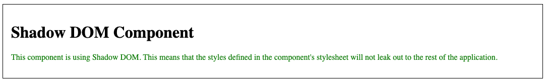
<p>
This component is using Shadow DOM. This means that the styles
defined in the component's stylesheet will not leak out to the
rest of the application.
</p>
</div>
`,
styles: [`
.shadow-dom-component {
border: 1px solid black;
padding: 1rem;
}
p {
color: green;
}
`],
encapsulation: ViewEncapsulation.ShadowDom
})
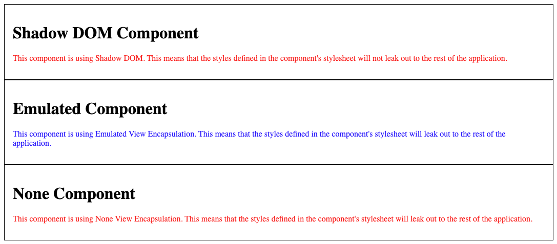
ShadowDom로 설정한 경우 컴포넌트 삽입시 쉐도우 루트 안으로 생성되며 컴포넌트의 스타일도 쉐도우 루트 안에서 생성되므로 외부에 영향을 주지 않는다.
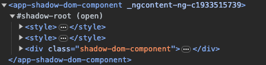
결과는 아래와 같이 표기된다.
Emulated
@Component({
selector: 'app-emulated-component',
template: `
<div class="emulated-component">
<h1>Emulated Component</h1>
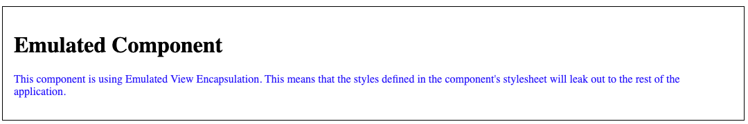
<p>
This component is using Emulated View Encapsulation. This means that
the styles defined in the component's stylesheet will leak out to the
rest of the application.
</p>
</div>
`,
styles: [`
.emulated-component {
border: 1px solid black;
padding: 1rem;
}
p {
color: blue;
}
`],
encapsulation: ViewEncapsulation.Emulated
})
Emulated로 설정한 경우에는 쉐도우 루트안에 들어가지 않고 스타일도 헤더에 생성되지만 앵귤러에 의해 임의로 생성된 속성이 컴포넌트의 추가되며 컴포넌트의 스타일이 해당 속성안에서만 적용되기 때문에 외부에 영향을 주지 않는다.
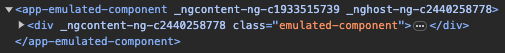
결과는 아래와 같이 표기된다.
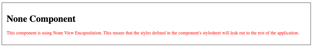
None
@Component({
    selector: 'app-none-component',
    template: `
        <div class="none-component">
            <h1>None Component</h1>
            <p>
                This component is using None View Encapsulation. This means that the
                styles defined in the component's stylesheet will leak out to the rest
                of the application.
            </p>
        </div>
    `,
    styles: [`
        .none-component {
            border: 1px solid black;
            padding: 1rem;
        }

        p {
            color: red;
        }
    `],
    encapsulation: ViewEncapsulation.None
})
None으로 설정한 경우에는 해당 컴포넌트에 선언한 스타일이 글로벌로 적용된다.
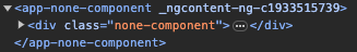
결과는 아래와 같다.
재밌는 점은 생성한 3가지 컴포넌트를 동시에 표기한 경우에 ShadowDom으로 선언한 컴포넌트의 텍스트 색상이 빨간색으로 표시된다. 쉐도우 루트안에 스타일 태그가 생성될 때 모든 컴포넌트가 가지고 있는 스타일이 포함되어 이와같은 현상이 생기는 것으로 보인다.
Data Binding
@angular/core의 Input 데코레이터를 사용해 외부로부터 입력받는 값을 만들 수 있다.
import { Input } from '@angular/core';

@Input() firstName
@Input() lastName
간단한 예시
@Component({
    selector: 'app-child-component',
    template: `
        <p>{{ firstName }}</p>
        <p>{{ lastName }}</p>
    `,
})
export class ChildComponent {
    @Input() firstName?: string;
    @Input() lastName?: string;
}
@Component({
    selector: 'app-parent-component',
    template: `
        <app-child-component [firstName]="firstName" [lastName]="lastName">
        </app-child-component>
        <button (click)="handleChangeClick()">Change</button>
    `,
})
export class ParentComponent {
    firstName = "Jino"
    lastName = "Bae"

    handleChangeClick() {
        this.firstName = "Aram"
        this.lastName = "Kim"
    }
}
아래와 같이 getter, setter를 사용해서 인풋을 핸들링도 가능하다.
private _firstName = '';

@Input()
get firstName(): string {
    return this._firstName + '!';
}
set firstName(firstName: string) {
    this._firstName = firstName;
}
Event Binding
@angular/core의 Output 데코레이터와 EventEmitter 객체를 사용해서 외부로에 값을 전달할 수 있다.
import { EventEmitter, Output } from '@angular/core';

@Output() onLike = new EventEmitter<void>();
간단한 예시
@Component({
   selector: 'app-child-component',
   template: `
       <button (click)="onLike.emit()">
           Like {{ hasLiked ? '❤️' : '🤍' }}
       </button>
   `,
})
export class ChildComponent {
   @Input() hasLiked?: boolean;
   @Output() onLike = new EventEmitter<void>();
}
@Component({
   selector: 'app-parent-component',
   template: `
       <app-child-component [hasLiked]="hasLiked" (onLike)="handleLike()">
       </app-child-component>
   `,
})
export class ParentComponent {
   hasLiked = false

   handleLike() {
       this.hasLiked = !this.hasLiked
   }
}
emit 할 때 값을 던져주면 부모에서 해당 값을 받을 수 있다.